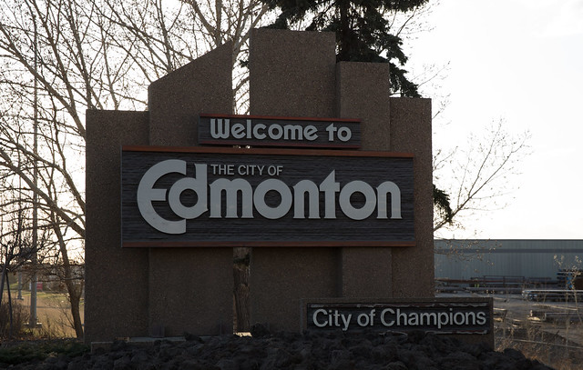
Until the late 1980s, Edmonton’s city limits were marked with simple blue and white signs that said “Welcome to the City of Edmonton”, not unlike the signs you’ll find near entrances to dozens of other towns around Alberta. The marker “City of Champions” was added following a streak of wins by the Eskimos and Oilers, though many also attribute that slogan to the way the city came together during the tornado of 1987. Not long after, City Council decided the existing signs were tacky and commissioned a study on the wording and design of new signs. That study decided that the word “welcome” was no longer necessary, but the “City of Champions” moniker was to remain.
The sign welcoming visitors entering Edmonton via the Sherwood Park Freeway
And so, Edmonton’s concrete entrance signs, made of sandblasted concrete shaped into a stylized silhouette of the city skyline, were erected from 1989 to 1991. A total of nine signs were put up, the last of which was located so close to St. Albert that aldermen there complained and threatened to redraw the southern boundary so that the sign would be on their land.
Others also disliked the signs. In April of 1989, Calgary mayor Don Hartman said Edmonton should tear the signs down. “Calgary has replaced Edmonton as the City of Champions,” he said. A cartoon in the paper next day also made fun of the signs by depicting new signs on the north edge of Calgary that read “City of Champs, 1 KM” on the southbound side and “City of Losers, 290 KM” on the northbound side.
But Edmontonians liked the signs. In late 1991, the Journal ran a reader poll about whether or not to keep the new signs. “Overall, 70 per cent of survey respondents say the signs are fine,” the paper reported. They found that residents in Sherwood Park, elsewhere in Alberta, and even outside Alberta all liked the signs.
Some locals grew to dislike aspects of the signs, however. Alderman Ron Hayter complained that the signs did not extend a welcome to visitors and were thus unfriendly. It took a while, but in the fall of 1996 the words “welcome to” were added. The total cost for adding that box to all nine signs? Just $8,837.93 ($982.00 each).

Photo courtesy of CBC
In late 1999, City Council began considering updated Highway 2 Corridor Design Guidelines. They also proposed spending $65,000 to “place signage of a complimentary, but smaller nature, to that of the major entrances” at thirteen other entrances to Edmonton. While discussing the report in June 2000, City Council passed the following motion:
“That the designation “Alberta’s Capital City” or other similar phrase be added to signage on Edmonton’s nine major entrance highways and included on any future entrance signage. Further that a report, including both the feasibility of this proposal and the cost involved, come back to the August 23, 2000 Executive Committee meeting.”
In the fall the report came back and said that adding the words “Alberta’s Capital” to the nine existing major entrance signs would cost an estimated $28,500. Council decided that was a bit too expensive, but a subsequent plan to spread the cost over three years was approved in December 2000. As you can see in the first photo above, the signs have fallen into disrepair and this addition isn’t even present on every sign anymore!
In December 2005, Council approved $625,000 for new entrance signs on the Stony Plain Road and Yellowhead East entrance corridors (they had already approved another $275,000 in December 2004). Manasc Isaac Architects provided an initial concept for the Stony Plain Road entrance sign:

The design concept for the Yellowhead East entrance came from Gibbs and Brown Landscape Consultants:

In March 2006, Council decided that a design competition would be held for the two new signs and that the newly formed Edmonton Design Committee would manage it. The competition drew eighteen submissions from across the country, and in May 2007 two finalists were selected: a pyramid-based design from local architect Gene Dub and a ribbon of steel design by Montreal architect Sylvie Perrault. Both received a $50,000 honoraria to take their designs to the next stage which included preliminary plans, a model, engineering assessments, and cost estimates.

Throughout 2007 there was a lot of debate about the new entrance signs (frequently called “entrance markers” at the time for some reason). “At some point, the old signs do need to be replaced,” said Councillor Karen Leibovici as the discussion grew more heated. Her Council colleagues seemed on board with the idea of replacing the entrance signs, but they may have been the only ones.
The most common complaint from the public was related to the cost. The City estimated the cost of the original signs to be around $400,000 each and replacing just two with new ones would cost between $600,000 and $1.4 million. But cost wasn’t the only concern. Soon after the two final designs were unveiled, citizens registered their dislike for both. Of 268 phone calls made to the City, only 2 were favorable.
Some people defended the design competition and the spending though. Then Journal columnist Todd Babiak wrote in May 2007, “the public reaction to the city’s design competition is emerging as my new least-favourite thing about Edmonton.” He argued that “to frame this project in terms of spending priorities in incoherent.” While he agreed that Edmonton was being “starved to death” by the other levels of government, he argued in favor of spending on the signs as public art:
“In 10 years, we won’t remember the potholes of 2007. But giant pyramids on each end of the city could be there, still inspiring debate.”
“If we continue to configure our priorities, as a community, around a reflexive, mean- spirited and frankly stupid hostility to cultural spending, the filled potholes will allow a lot of very smooth one-way trips out of this cold, efficient province.”
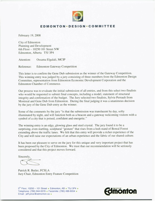
In February 2008, the jury selected Gene Dub’s proposal. A letter from the Edmonton Design Committee said the decision was unanimous and that “the winning entry is an edgy, glowing glass and steel crystal.” They called the design “surprising, even startling” and said it would “function both as a beacon and a gateway welcoming visitors with a symbol of a city that is poised, confident and energetic.”

But wasn’t meant to be. By the time City Council was getting ready to make a final decision, the estimated cost had ballooned from $900,000 to more than $2.5 million. Council voted 6-5 against the proposal in July 2008, bringing the debate to a close (at least temporarily). Writing about the decision in the Journal, then-columnist Scott McKeen called Council “hypocritical” and said a majority of them “caved badly under the weight of public pressure.”
There has always been some minor discussion about the signs, but in the last two years, the debate has once again become interesting. In October 2013, vandals made their mark on the signs, replacing the “City of Champions” section with their own humorous slogans like “City of Speed Traps”, “Suck it Calgary”, and “City of Champignons”.

Last fall, Councillor Michael Oshry officially reopened debate about the signs, saying “we need branding that demonstrates what we are about now and where we’re going and not about where we were 30 years ago.” He has since suggested an acceptable initial step would be to simply remove “City of Champions” from the signs. He is expected to make a motion to that effect at Tuesday’s City Council meeting.
According to the latest City report, just seven of the major entrance signs remain (the two welcoming visitors from St. Albert and along Highway 28 no longer exist). An option to fund new signs with corporate advertising was quickly dismissed by Mayor Iveson. “Not on my watch,” he said. A new design competition could be an option though, as could a public search for a new slogan. That’s not necessary though, according to Mayor Iveson. “We’re in the post-tagline era,” he said.
For better or for worse, debate about Edmonton’s entrance signs has always been conflated with debate about our brand and image. I’ll examine that in more detail in an upcoming post.
 Earlier today, local architect Gene Dub released some