The Edmonton Valley Zoo, which opened in 1959, is in the midst of a major transformation. City Council approved a Master Plan to revitalize the zoo in 2005, and in 2009 finally committed some funding to the project. Over the last year or so we’ve started to see signs of progress, with the September 2010 opening of a new veterinary hospital and construction of the $16.7 million Arctic Shores habitat well underway. The zoo’s historic Storyland characters are now gone to make way for the new construction projects. There’s a long way to go still, but the vision is coming to life.
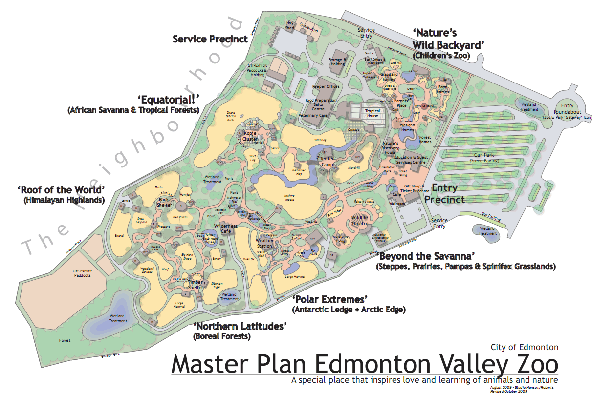
Though the Master Plan had been approved for four years, the realization that things were going to change didn’t sink in for Denise Prefontaine and her team until the funding announcement was made. As the Director of the Valley Zoo, Denise saw incredible opportunity with the Master Plan, and still gets quite excited when she talks about all of the plans. “It will help change the perception of the zoo,” she told me. When details of the Master Plan were first revealed, there was a lot of talk that the Valley Zoo was going to try to compete with the Calgary Zoo. Denise set the record straight: “The Valley Zoo will continue to grow as an educational and conservation facility; the footprint will not change.” She knew what the zoo was all about, but clearly it wasn’t be communicated as well as it could have been.
In early 2010, Denise decided to bring a group of people together to look at the zoo’s brand. They held a workshop, talked about the plans for the zoo, and to their surprise quickly coalesced around a shared vision. “We wanted to build on the strengths of the zoo,” she recalled. “It’s a warm place to be, you can interact with the animals.” Here’s the new vision statement for the Edmonton Valley Zoo:
A special place that inspires love and learning of animals and nature.
“When people saw the vision statement, they said ‘yep, that’s it!’” The exercise was useful, but it was also just part of a bigger learning process for the team. They quickly realized how much work and thought goes into building a successful brand. “It affects so much more than just your logo,” Denise told me. In addition to the vision statement, there are four key values embodied in the brand:
- Stewardship – True stewards, staff at the Edmonton Valley Zoo provide the highest quality care at home and strongly support conservation efforts worldwide.
- Conservation – Passionately practice environmental stewardship.
- Education – Encourage and inspire learning through engaging and memorable events and activities.
- Engagement – Fun experiences and rich interactions create lasting memories.
The new brand also features five characteristics that the zoo aspires to:
- Intimate
- Inspiring
- Nurturing
- Natural
- Cool
It’s about connecting with the animals. It’s about intimate experiences that make learning accessible and stimulating. It’s about a high quality of life for the animals living at the zoo. It’s about connecting with nature and learning how to help conserve the planet for future generations. It’s about new state-of-the-art facilities to allow you to observe clearly, and engage authentically. It’s about getting closer.
“The fundamental experience of human/animal bonding and its benefits for animals, people, learning and our society and environment.”
If the brand is all about getting closer, the challenge became conveying that in a logo. The solution? Eyes!

As of today the Valley Zoo will begin using its new logos. Yes, that’s plural. “The zoo has many different faces, so we have a series of logos rather than just one,” Denise told me. Each logo features a different animal face, with the eyes standing in for the letter ‘o’ in the word zoo. “We tried it with lots of different eyes, and some just didn’t work.” They currently have eight logos, but may add more in the future.

Through the use of the animal’s eyes, the logo brings you closer, which is exactly what the zoo aims to do. Calder Bateman is responsible for the creative work, which is really the only part of the brand that hasn’t been shared until now. “We’ve been using brand personality internally since last year, but not the visual identity,” Denise said. Each logo features its own color palette, and all use the Haptic font (with Arial serving as the secondary/alternate font). The placement of the words is reminiscent of the Valley Zoo Development Society’s logo.

The new logo and brand are appropriate given the physical transformation underway at the zoo, but I just had to ask about leaving the old logo behind. “Our current logo gives the mistaken impression that the zoo is about just one animal,” Denise told me. Do a search online and it doesn’t take long to come across the controversy surrounding Lucy, the zoo’s elephant. But that wasn’t really a factor in creating the new visual identity. “Eventually the zoo will no longer have elephants,” Denise noted.
 The new logos put the animals front and centre. “Using multiple faces lends itself to both serious and fun,” Denise told me. They’ve certainly been embracing that notion – last night the website went offline to make way for a new one, so visitors were greeted with the picture to the right and the following message:
We just need a bit of time to look our best for everyone – shedding our skin, preening our feathers, fluffing our fur.
The goal was to have the website plus all signage, advertisements, uniforms, and other materials using the new visual identity starting today.
As a way to celebrate the new brand and direction for the Edmonton Valley Zoo, the City is holding a contest on Facebook and at Connections 2011 (on ShareEdmonton). If you can correctly match one of the zoo’s new logos with the animal it represents, you’ll be entered into a draw for a family pass to the zoo! Also, as part of the zoo’s celebration weekend on May 7 and 8, visitors can take part in a special scavenger hunt to match some of the logo animals with their real life counterparts among the 350 animals living at the Valley Zoo. For more information, check out the new Edmonton Valley Zoo website.
From the moment I saw the new logos, I loved them. After learning a bit more about the reasons behind the new brand and the journey the Valley Zoo has embarked on, I love them even more. What do you think?
 I have to admit I’m fascinated by branding, especially when a long-established brand identity is updated. That’s what is happening right now at Xerox. The logo we’ve come to know over the last 40 years is no more, replaced by the one shown to the right. Don’t be fooled – creating a new identity isn’t simple.