For more than 20 years, Edmontonians have been discussing whether or not our entrance signs should feature a slogan and if so, which one. Whenever City Council or other local leaders have felt the need to shore up our city’s image, the entrance signs have been the go-to starting point. And whenever someone has suggested the entrance signs are dated and need to be replaced, the conversation has inevitably morphed into one about the slogan and brand for our city.
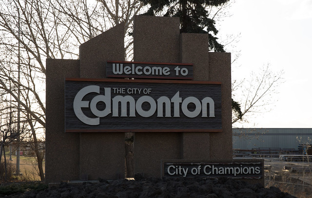
Questions were raised about “City of Champions” as soon as the signs went up in 1989. That prompted Economic Development Edmonton to do some research and a few years later they found there were at least 27 slogans being used to describe the city, like “Gateway to the North”, “Canada’s Oil Capital”, and “Official Host City for the Turn of the Century”. But only one was highly visible, and that was “City of Champions” thanks to the entrance signs.
You only see the entrance signs if you drive into Edmonton, but that hasn’t diminished their importance in the eyes of community leaders and commentators. The entrance signs and debate about them have often been considered the manifestation of our identity as a city. Gene Dub’s controversial entrance pyramid design that won a national design competition in 2008 was a good example of this. It would have done away with slogans and logos in favor of striking public art. The jury called it “a symbol of a city that is poised, confident and energetic.” But not everyone saw it that way. Former Edmonton Journal columnist Lorne Gunter compared the idea to Bedford, Nova Scotia’s giant “Clearwater” lobster statue and said Dub’s proposal would have been “an artificial symbol erected by civic leaders to try to force a recognition of their community that isn’t happening on their city’s or town’s own merits.”
It’s no surprise then that the entrance signs as they exist today are a perfect representation of this conflation of issues. The signs have been cobbled together, piece by piece, just like our city’s brand. In the absence of a strong place brand for Edmonton, we used the City of Edmonton’s corporate logo and the “City of Champions” moniker as stand-ins. When we felt that perhaps we weren’t a welcoming enough place, the words “Welcome to” were added. When we didn’t feel important enough in the province, we added “Alberta’s Capital”. Whenever our sports teams have endured slumps, we’ve suggested removing “City of Champions” from the signs (but someone has always pointed to another local success as a reason to keep them).
And now, because we’re feeling emboldened by population and economic growth, not to mention lots of capital spending, we’re again looking to the signs. They don’t feel representative of Edmonton today nor of the Edmonton we hope to become. They’re old and they look it.
Will the discussion be different this time? I think it could be. Yes, the sign and city identity issues have become so intertwined that maybe it’s not even possible to separate them now. But we should try.

Photo by Dave Cournoyer
On Tuesday, Councillor Michael Oshry is expected to make a motion requesting that the City remove “City of Champions” from Edmonton’s seven remaining entrance signs. The City says the signs are structurally sound, but that’s not why Councillor Oshry is making this proposal. Removing the slogan could finally allow us to discuss the brand issue separately from the signs, and I think that’s really his endgame.
I asked Councillor Oshry why he brought the sign debate up again at Council, and he admitted it seemed like a good starting point for a broader discussion about Edmonton’s brand. “They look dated, they’re old,” he said of the entrance signs. He isn’t fond of the “City of Champions” slogan either. “When we’re trying to attract people, the slogan means nothing,” he said. “And the slogan isn’t actually used anywhere else!”
At least, it’s not used anywhere else in Edmonton. We don’t use it for any of our internal or external marketing. But other cities use it or have used it, like Boston, San Francisco, East St. Louis, Pittsburgh, Inglewood, Tuscaloosa, Syracuse, Tampa, and Brockton, to name just a few. There’s nothing unique or particularly Edmonton about the “City of Champions” slogan.

Photo by Paul Sableman
Removing “City of Champions” is low-hanging fruit that could enable us to get started with a fresh slate, Councillor Oshry said. He doesn’t know where this will lead, but if we do end up discussing new signs, he favors simple ones. “They shouldn’t even have the corporation logo on them, it should just be ‘Welcome to Edmonton’ the place.” He also doesn’t want to spend tons of money on new signs. “They don’t have to be the greatest things the City does, but they need to be better than average,” he told me.
Ronna Bremer, Director of Image, Brand, and Marketing (or just “reputation” for short) in Corporate Communications at the City of Edmonton, agrees that the signs should be replaced with something simple but attractive. “What do those dated signs say about our city?” she asked rhetorically. “They should just say ‘Welcome to Edmonton’.”
EEDC and its predecessors have frequently been included in the discussion about entrance signs and slogans (no doubt thanks to the conflation of issues). “The decision about the welcome signs belongs firmly in the hands of the City and City Council,” EEDC CEO Brad Ferguson told me. He added that for what its worth, he thinks “the signs are dated and we need new ones” but stressed “that’s different from needing a new logo and slogan.”
It has been suggested that new signs would only come after the City makes a final decision on a new brand and logo. That would be the wrong approach to take. There are three different things wrapped up in that suggestion – the signs themselves, Edmonton’s brand and identity, and the City of Edmonton’s brand. The signs do not need to include the City of Edmonton’s corporate brand; they exist to welcome visitors to Edmonton, not to the new City of Edmonton office tower or to a recreation facility. It was probably a mistake to put the corporate logo on them in the first place.
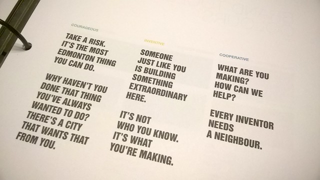
The signs should be representative of Edmonton the place. They should reflect Edmonton’s place brand. This is the work that Make Something Edmonton has been doing. They haven’t been trying to figure out what the City’s new logo should be. They’ve been working to identify the essence of Edmonton. From their brand book:
“A place cannot be reduced to a logo and a slogan. It’s more than marketing. The Edmonton brand is about being true to who we are at our best.”
They have come up with “statements of encouragement” which are kind of like slogans, but there are many of them, and you’re supposed to take inspiration from them to create your own. “Be playful about it,” the brand book says. The statements of encouragement are conversation-starters and are “simple, memorable ways to express Edmonton-ness.” But they’re not a collection of possible slogans. It would be wrong to pick one and put it on the entrance signs.
The brand promise is the heart of the place brand:
“If you have the courage to take an idea to reality, to build, to make something, Edmonton is your city.”
That’s what any new entrance signs need to reflect.
So how do we do that? “We could tell people a story as they enter the city,” Todd Babiak told me. He has been working on Make Something Edmonton since the beginning, and he has thought a lot about this. What if instead of a single static slogan, we changed the message on our entrance signs every now and then? What if instead of one entrance sign, we had many, each featuring a different statement of encouragement or example of local makers? We talked about the “City of Champignons” sign that some pranksters plastered over the existing “City of Champions” sign a couple years ago. “You could argue that’s the most Edmonton thing anyone has ever done!” Todd said.
He’s not sure what the answer is, but he knows how we should go about finding it. “There’s a way to build things in Edmonton,” he said. “If you want it to work, invite the community in.”
It sounds difficult, but I think it can work. Right now we don’t see Edmonton’s place brand reflected in very many places. But over the next year or two, if Make Something Edmonton and EEDC are successful at getting others on board, that will change. And then our entrance signs simply need to be consistent with the branding we use elsewhere, like at the airport or at our post secondary institutions. Let’s see what people come up with before trying to design new signs. And please, let’s remember they’re just signs!
In the meantime, we should remove “City of Champions” from Edmonton’s entrance signs to bring clarity to this discussion. The signs don’t need logos or slogans and neither does Edmonton.
You can learn more about the history of Edmonton’s entrance signs here.

Yeg your exploration gatewayf