Ever wonder where the candidates in last month’s municipal election received the most support? Which parts of the city supported which mayoral candidates? After seeing the maps that were created for Calgary’s top three mayoral candidates, I wondered about the same kind of thing here. Local software developer Josh Kjenner was also interested, and he has been busy visualizing the results by polling station ever since.
Josh wrote an application called Metroview for the City of Edmonton’s Apps4Edmonton competition, a project which he spent about 60 hours on. The tool is implemented in Processing, a programming language and environment that Josh called “a really really intense Java library.” He returned to the project after the City of Edmonton released the final election results by polling station, and spent another 20 hours or so improving it. Josh told me the biggest challenge he faced was conditioning the KML files from the open data catalogue (a common challenge that open data developers face…getting the data and the tools/technology working together).
The result is an interactive application that lets you visualize candidate support and other data on a map of Edmonton.
Here are a few of the data visualizations you can see in Josh’s metroview yegvote 2010 app (requires Java).
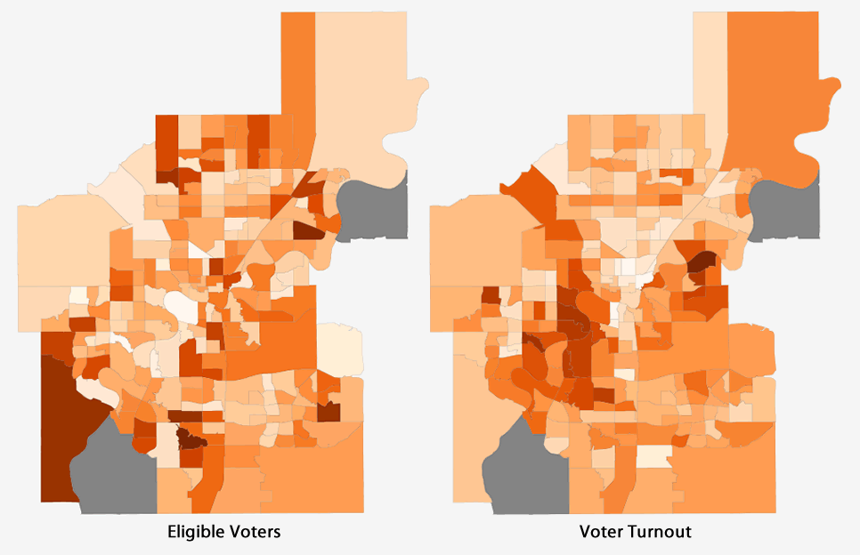
Eligible voters versus voter turnout:
Support for Stephen Mandel:

Support for David Dorward:

Support for Daryl Bonar:
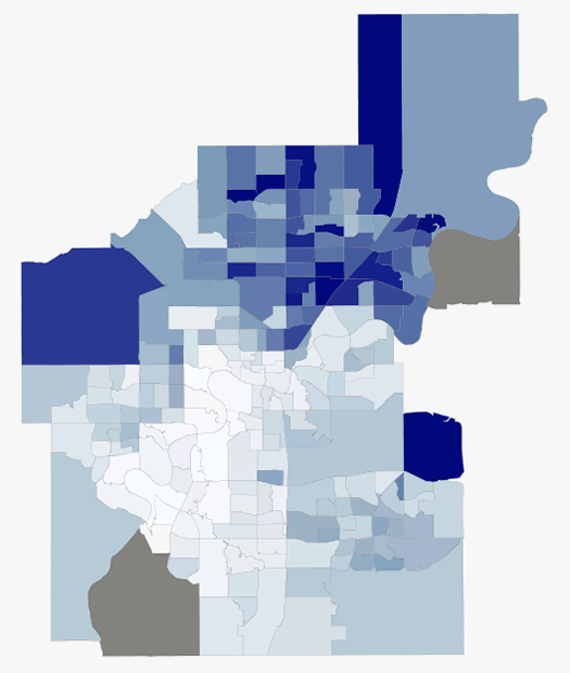
You can see that Mandel received most of his support from the south part of the city, while Dorward received the most support from the north part. You can use the metroview tool to see similar results for every ward, public school ward, and catholic school ward too.
Thanks Josh for creating this tool! This is another great example of what can be created when the data is open and available.
UPDATE: It should be noted that you can’t really compare Mandel’s graph to Dorward’s. A dark area in Mandel’s is not equivalent to a dark area in Dorward’s, for example, because of the difference in the number of overall votes that each candidate received. The colors on each graph are in relation to the other areas on that graph for that candidate only. If you look at Josh’s app, you get the raw values as you hover over each area, and you can choose absolute instead of relative for the drawing mode.
